Why AI Generated Logos Look Great... But Fail in the Real World
There's a growing trend among business owners to use ChatGPT to generate logo's for their small business. The results look great, but here's why they don't work in the real world (at least not yet)
There’s a growing trend right now.
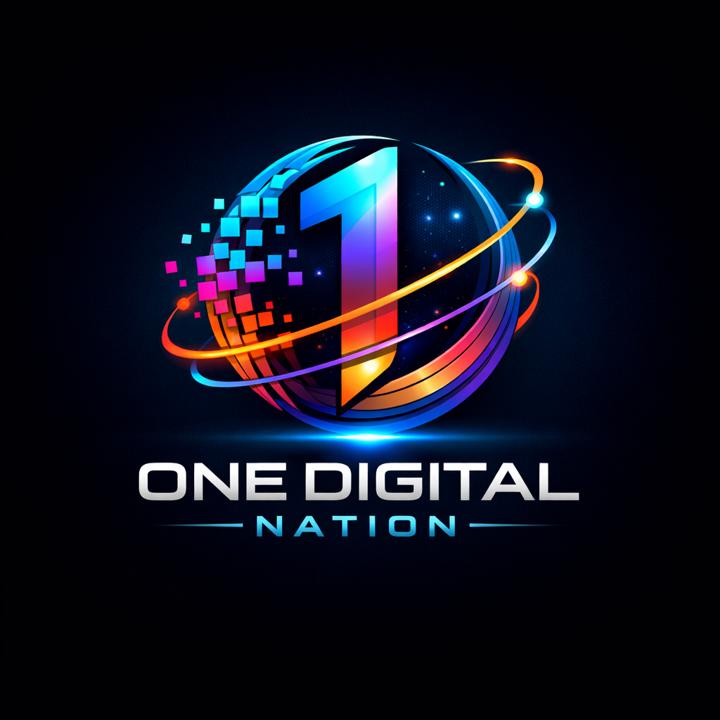
Business owners are turning to AI tools like ChatGPT to generate logos. At first glance, the results look incredible. Rich detail, vibrant colours, storytelling baked into a single image.
But there’s a problem.
Most of these aren’t actually logos. They’re something else entirely.
And unless you understand the difference, you risk building a brand that looks good on day one… but breaks everywhere else.
The Misconception: “This looks great, so it must be a good logo”
Let’s start with a simple truth: -
A logo isn’t judged by how it looks. It’s judged by how it works.
The type of image AI typically produces is best described as:
An illustrated emblem
A storytelling visual
A “brand scene”
And to be fair, it often does a brilliant job at that.
These images: -
Capture place, culture, and emotion
Feel warm, human, and community-driven
Work beautifully on posters, social media, and promotional material
But that’s not the job of a logo.
What a Logo Actually Needs to Do
A professional logo has to survive reality.
That means working across: -
A 16px favicon
A website header
A printed invoice
Embroidery on clothing
Large-format signage
Black & white print
Low-quality reproduction environments
That leads to a set of non-negotiable principles: -
Simplicity - Your business needs to be recognisable at a glance.
Scalability - Works at both tiny and large sizes.
Versatility - Functions in colour, monochrome, and reversed.
Reproducibility - Can be printed, stitched, etched, or engraved.
Memorability - Distinct without relying on detail.
Where AI-Generated “Logos” Fall Down
The typical AI-generated image struggles in three key areas: -
Scalability: It collapses when reduced
Reproducibility: Too detailed for real-world production
Flexibility: Elements can’t be separated or adapted
And there’s a practical issue too. Most outputs are delivered as JPG files, which are essentially dead-end assets for professional use. What you actually need is: -
SVG
AI or EPS
Clean vector paths
Controlled typography
Without that, you don’t have a logo system. You have an image.
The Hidden Blind Spot
Here’s where most people go wrong. They assume “If it’s not a good logo, it’s not useful.” That’s not true. It’s just been misclassified.
What AI is producing is often valuable. Just not in the role people are assigning to it.
How Modern Brands Actually Work
Strong brands don’t rely on a single logo anymore. They use a system. Typically, that looks like: -
Primary Logo - Simple, clean, and used everywhere.
Secondary Mark - A badge or crest for more expressive use.
Brand Illustration - High-detail visuals used for storytelling.
Supporting Assets - Icons, patterns, typography.
The mistake isn’t using AI-generated artwork. The mistake is trying to make it do everything.
Where These AI Images Do Belong
Used properly, they’re powerful. They’re ideal for: -
Website hero sections
Event posters
Social media content
Merchandise
Community storytelling
Brochures and funding applications
They add something most logos don’t. Emotion. Context. Identity beyond the name.
The Real Limitation of AI (That No One Talks About)
There’s another issue... and it’s a big one.
AI cannot guarantee consistency.
Even if you try to recreate or refine an image: -
Small details change
Styles drift
Colours shift
Elements move
That makes it extremely difficult to build a cohesive brand system. In practical terms, that means: -
Your favicon won’t quite match your logo
Your logo won’t quite match your illustration
Your brand starts to feel inconsistent
For a business, that’s a problem, because consistency is what builds recognition.
What a Better Approach Looks Like
Instead of rejecting AI - or blindly relying on it - the smarter approach is to use it in the right place.
Step 1: Create a simple core logo. A clean wordmark or minimal symbol that works everywhere.
Step 2: Keep the AI-generated artwork and use it as a hero visual or brand illustration.
Step 3: Build a system. Separate identity (logo) from expression (visual storytelling).
The Bottom Line
You’re not wrong to use AI-generated logos. But the real issue isn’t that they’re “bad.” It’s that they’re being used incorrectly.
Used properly, they’re a powerful asset. Used incorrectly, They become a liability
The goal isn’t to choose between design excellence and visual appeal. It’s to understand the difference between a logo and everything that supports it
If you get that right, you don’t just end up with something that looks good. You end up with something that actually works.